Painting Techniques
Light and Shadow in Painting: A Beginner's Guide
How to paint light and shadow: the light source, a value scale, the kinds of shadow and acrylic step by step, plus the mistakes beginners make most.
Updated:
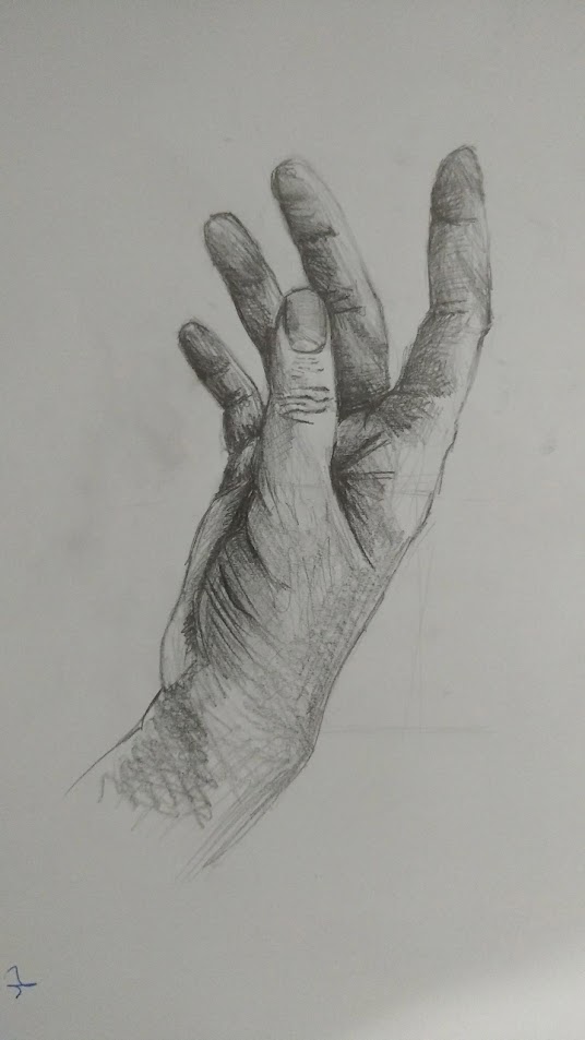
To paint light and shadow, first fix a single light source, then reduce the tones you see to three to five values and build the painting up in layers with those values. Paint shadows not with black but with a darkened version of the object's own colour. The feeling of volume comes not from colour but from the relationship between light and dark.
Light and shadow is one of the most basic subjects in painting, and one of the most postponed. Colour is more tempting, composition more intellectual. But when a painting looks flat, the problem is usually neither colour nor composition. The values are simply too close together.
Why is fixing the light source the first step?#
Because every shadow follows from it. If light comes from the left, the left side of the object is lit, the right is dark, and the cast shadow stretches to the right. The rule is that simple, but it slips as a painting progresses: painting one object as if lit from the left and the one beside it as if lit from the front creates an inconsistency the eye flags at once.
Before you begin, draw a small arrow in a corner of the canvas or make a note. From which direction and what height does the light come? Light from above gives short, dark shadows; low light gives long ones.
When practising, set up the light yourself. Turn off the ceiling light and aim a single desk lamp from the side and slightly above. Several sources cancel each other's shadows and make it hard to read why anything is dark. Window light is a good source too, but it moves through the day and causes inconsistencies in long sessions.
Kinds of shadow: form shadow, cast shadow, reflected light#
What we call "the shadow" on an object is not one thing. Light an egg or a white mug from the side and you will see:
- Highlight: the brightest point, where light reflects directly. Weak on matte surfaces, sharp on glossy ones.
- Light side: the part of the object facing the light.
- Halftone: the transition between light and shadow. Most of the sense of volume lives here.
- Form shadow: the object's own surface turned away from the light.
- Core shadow: the darkest band within the form shadow, closest to the lit area. The part beginners most often miss.
- Reflected light: weak light bouncing back into the shadow side from the table or a nearby surface. It separates the object's edge from the background.
- Cast shadow: the shadow the object throws onto the table or wall behind. Darkest and sharpest where it meets the object, lighter and softer-edged further away.
A warning about reflected light: despite the name, it is still part of the shadow. Paint it as light as the lit side and the object loses its volume.
How do you make a value scale?#
Value is how light or dark a colour is. It is independent of hue: a red and a green can have the same value, and in a black and white photograph both turn the same grey.
Making a value scale is the fastest way to train your eye to see this.
Draw five squares side by side on a sheet. Leave the first as the white of the paper and fill the last with your darkest paint (or a soft pencil). Paint the middle square a grey exactly halfway between them. Fill the remaining two with the halfway steps in between. Getting the steps to look even may take a few attempts; in most people's first scale the light tones come out too close together.
Five steps are enough to start. Those who want finer control make a nine-step scale. Then hold the scale up beside your subject and ask which square each area of the object matches.
There are two easy ways to see value: squint (it removes detail and leaves the large masses of light and dark), and take a black and white photo of the subject with your phone. Black and white printmaking is also a good school for thinking in values. As I explained in what a linocut is, lino has only two values and all the volume is built with them.
Light and shadow in acrylic, step by step#
Acrylic dries fast. For light and shadow that is both an advantage (layers go on top of each other straight away) and a difficulty (there is little time for soft blends). The sequence below is for a study of a single object.
Toned ground
Do not leave the canvas white. Brush on a thinned coat of a mid-value, slightly warm tone (burnt sienna mixed with white, for example). On a white ground every tone looks darker than it is; a mid-value ground lets you judge lights and darks correctly.
Large dark masses
First block in the form shadow and cast shadow flat, with a single dark value. No detail. At this stage the painting should look like a two-value blot.
Middle tones
Paint the lit side in a mid-light value, then place the halftones between the two masses. Bring out the core shadow here as well.
Softening transitions
There are two ways to blend in acrylic: drag two tones into each other with the brush while wet, or build the in-between tone after drying with thin glazes on top of each other. A wet palette or a retarder medium helps hold off the fast drying.
Lights and the highlight
Leave the lightest values and the highlight to the very end. The highlight takes up the least space in the painting and does the most; put in too early, it gets muddied by the layers that follow.
Reflected light and edges
Finally, add a weak reflected light along the edge of the shadow side and soften the far end of the cast shadow.
Acrylic darkens slightly as it dries. A tone that looks exactly right while wet can sit one step darker once dry; mixing light tones a touch lighter compensates. If you need a materials list, I put one together in how to start with acrylics.
Coloured shadow: is a shadow black?#
No. Darkening a shadow with black muddies the colour and makes the shadow area look dead. The shadow of a red apple is not black; it is a darker, slightly cooler red.
A livelier way to build a shadow tone is to darken a colour with its complement. Mixing red with a little green, orange with a little blue, yellow with a little violet lowers the value and greys the colour without killing it. I explained how complementary colours work in the colour wheel.
The colour of the light also sets the colour of the shadow. Under warm light (sunset, a tungsten bulb), lit surfaces look warm and shadows relatively cool. Under cool light, the reverse. The Impressionists' blue and violet shadows came from exactly this observation.
A mix of ultramarine blue and burnt sienna is the most practical dark to use instead of black: change the ratio and you get a warm or a cool dark.
Five common mistakes#
- Values too close together. The painting is finished but looks flat. Fix: squint or take a black and white photo. Is there enough distance between the lightest and the darkest?
- Outlining the edge. A dark contour around the object makes it look like a cartoon. In reality volume turns in the halftone, not at the edge.
- Painting reflected light too bright. The object looks split down the middle.
- Forgetting the cast shadow. Without it, the object does not sit on the table; it floats.
- Giving every edge the same sharpness. Edges near the light and the point where the cast shadow meets the object should be sharp; distant edges should be soft.
Once light and shadow are working, move on to the overall arrangement with composition in painting. I compared how acrylic and oil behave in oil or acrylic.
From the studio: Eş Çorap#
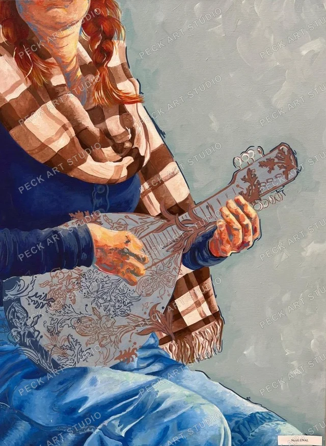
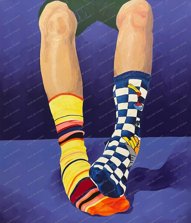
Eş Çorap (Matching Socks) in the gallery is a direct study of this subject. Acrylic on canvas, 60x70 cm, and the description on its page reads: a practice in colour, pattern, and light and shadow.
Painting a patterned fabric is a hard version of a light and shadow exercise. The pattern carries its own rhythm of light and dark, and on top of it comes the light and shadow of the folds. Keeping the two apart, not mistaking a dark stripe in the pattern for shadow or a light stripe in the shadow for light, is where reading values is really tested.
At the time of publication (28 October 2026) the work was priced at 5,000 TL and available. Other paintings are on the painting page.
Frequently Asked Questions
Should you use black paint for shadows?
It is not recommended. Black muddies colour and makes shadows look dead. Building the shadow with the object's complementary colour, or with a coloured dark such as ultramarine mixed with burnt sienna, gives a livelier result.
Which object should you start light and shadow studies with?
A plain, matte object with a simple form: an egg, a white mug or a ball. With no colour or pattern to distract, you can focus on value alone. Lighting it from the side with a single desk lamp shows the kinds of shadow clearly.
Is acrylic or oil easier for light and shadow?
Soft transitions are easier in oil, because the paint stays wet for a long time and tones can be blended on the canvas. Acrylic dries fast, so blends need thin glazes or a retarder, but being able to layer straight away is an advantage for value studies.
How many steps should a value scale have?
Five steps are enough to start: white, black and three greys between. As your eye gets used to it you can move to a nine-step scale. When painting, reducing what you see to three to five values gives the clearest result for most studies.