Inspiration
Composition in Painting: The Rule of Thirds, Balance and Space
Why one painting sits easy and another feels restless usually comes down to composition. The few rules that decide how the eye travels.
Updated:
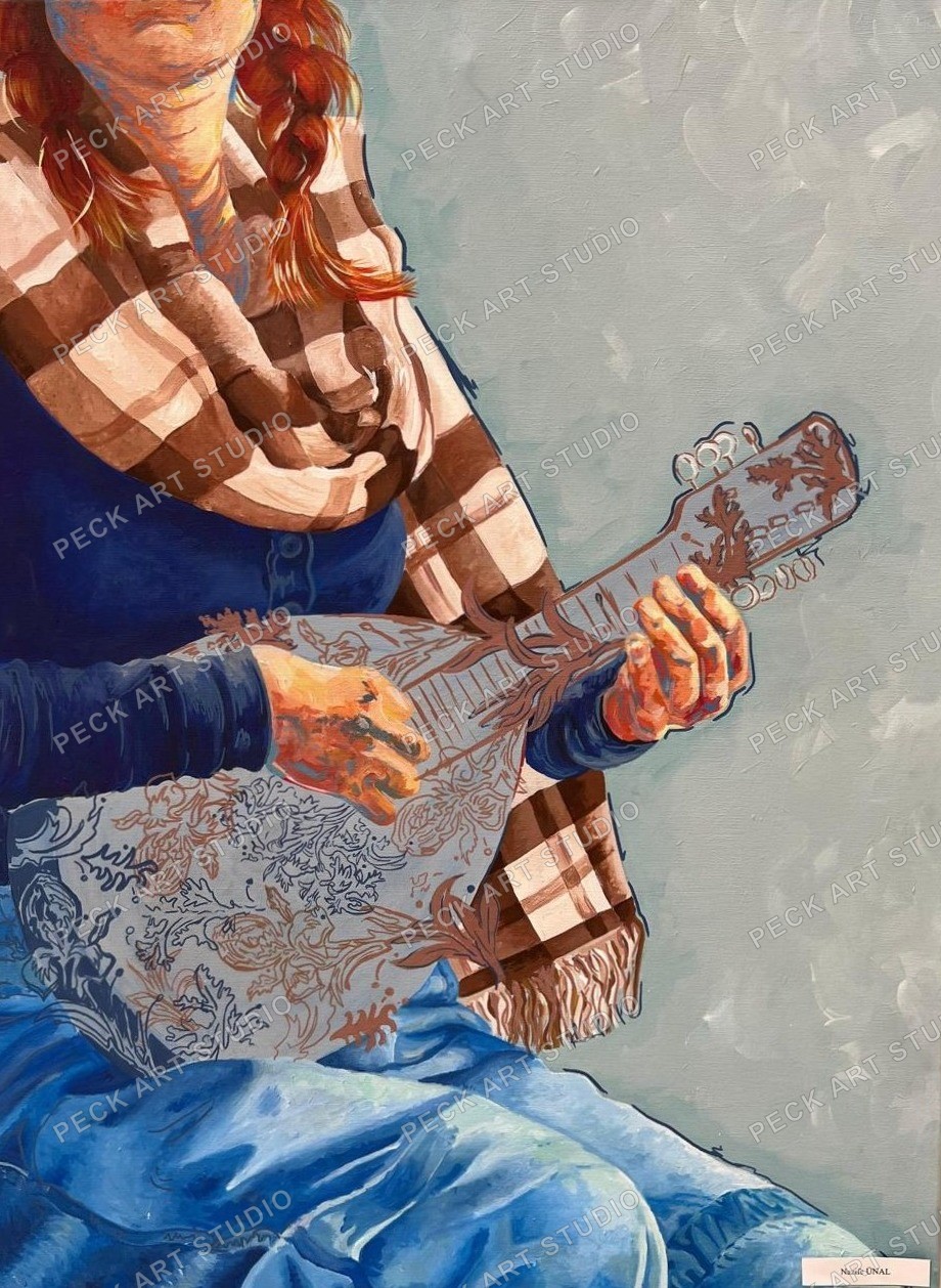
Composition is about where everything sits in a painting. Colour and technique can both be good, but if the composition does not hold, the work feels restless, and most people cannot name why.
The rule of thirds#
Divide the surface in three horizontally and vertically. Four lines cross at four points. Placing important elements on those points or along those lines almost always beats putting them dead centre.
The reason is simple: the centre is static. An object in the middle draws the eye and holds it there. Shifted off centre, it makes the eye move, because the eye looks for balance on its own.
A horizon works the same way. Placed in the middle it cuts the painting in two. Pulled to the upper or lower third, either sky or ground dominates, and the painting has decided what it is about.
What balance means#
Balance is not symmetry. A painting is balanced when a large, quiet mass on one side is answered by a small, bright mark on the other. Like a scale: a small weight far from the centre balances a heavy one near it.
Balance is built from:
- Size: a large area outweighs a small one
- Value: a dark mark is heavier than a light one
- Saturation: a bright colour is heavier than a broken one
- Detail: a densely textured area is heavier than a flat one
These four trade against each other. A small but very bright mark can balance a wide, pale field.
What space does#
An area left empty is not a gap. The space around a mark strengthens it. Filling the whole surface tires the eye and leaves nowhere to look.
Space also has direction. If a figure looks to the right, leaving room in front of it settles the picture; pressing it against the edge unsettles it. The same holds for the direction of movement in an abstract mark.
The path of the eye#
In a good composition the eye enters the surface, travels, and stays a while. Lines, shifts between light and dark, and aligned edges steer that.
A line running inward from the edge takes the eye into the picture. A line parallel to the edge pushes it out. Which is why diagonals carry more movement than horizontals and verticals.
Common mistakes#
Putting the horizon or dominant line exactly in the middle. The painting splits into equal halves and looks undecided.
Letting an important shape graze the edge. A form that touches the edge without being cut is uncomfortable; either bring it in or crop it deliberately.
Even spacing. Three marks at equal intervals read as a list, not a rhythm. Varying the gaps brings the surface alive.
Keeping everything the same size. Without hierarchy the eye does not know where to go.
How to check#
The most practical test is a mirror. Look at the work reversed and the imbalance habit hides from you shows at once. Photographing it on a phone and looking at the small screen does the same, because once detail drops away only the arrangement of masses is left.
Squinting also works. Detail disappears and the light and dark distribution remains. When working on an abstract, this check repeats at every stage.
When to break the rule#
The rule of thirds is a starting point, not an obligation. Fully symmetrical compositions, in religious painting and portraiture especially, produce stillness and gravity on purpose.
The difference between breaking a rule knowingly and unknowingly reaches the viewer. Look at the collection with this in mind and you will see the weight sits off centre in most of them.
Frequently Asked Questions
What is the rule of thirds?
Lines dividing the surface into thirds horizontally and vertically cross at four points. Placing key elements on those points or lines gives a more dynamic composition than centring them. The centre is static; it catches the eye and holds it.
Is balance the same as symmetry?
No. Balance is elements of different weight answering each other. A wide pale field on one side and a small bright mark on the other is balanced. Size, value, saturation and density of detail all trade against one another.
How do I check whether my composition works?
Three ways: look at it reversed in a mirror, photograph it and study it small on a phone, or squint. All three drop the detail and leave only the arrangement of masses, at which point the imbalance you had stopped seeing shows up.
Where should the horizon go?
Not in the middle. A central horizon splits the picture into equal halves and looks undecided. Pull it to the lower third to favour the sky, or the upper third to favour the ground.