Inspiration
The Colour Wheel: How Complementary and Contrasting Colours Work
Why do complementary colours glow side by side and turn grey when mixed? The part of colour theory that actually helps on canvas and on the wall.
Updated:
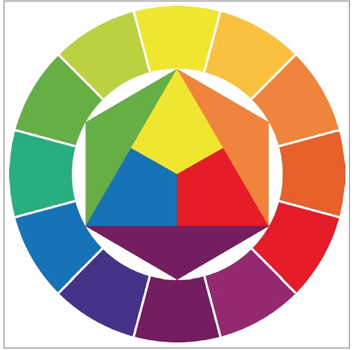
The colour wheel looks like something memorised at school, but the useful part of it is small and takes about half an hour to learn.
How the wheel is built#
Three primaries: red, yellow, blue. Mixed in pairs they give the secondaries: orange, green, purple. Those six sit at equal intervals around the wheel, with tertiaries between them.
What matters is not the order but the position, because the relationship between two colours is set by the angle between them.
Complementary colours#
Two colours directly opposite each other are complementary. Red and green, blue and orange, yellow and purple.
These pairs behave in two different ways, and both are useful.
Placed side by side they strengthen each other. A patch of orange on a blue ground looks far brighter than the same orange alone. The eye reads colour by comparison, so it exaggerates the gap.
Mixed together they cancel each other. Add green to red a little at a time and the colour moves towards grey. This is the natural way to knock a colour back in painting; black kills a colour, its complement calms it while keeping its character.
Warm and cool#
The wheel splits roughly in two. The side running from red to yellow is warm, the side from green to purple is cool.
Warm colours advance, cool colours recede. That is the simplest way to build depth in a painting: warm in front, cool behind. The same holds in a room, where a warm-toned work brings the wall closer.
Neighbouring and triadic harmonies#
Three neighbouring colours on the wheel, say blue, blue-green and green, give a calm, harmonious palette. The eye is not strained and the work reads as quiet.
Three colours at equal intervals, like red, yellow and blue, give a lively, restless palette. It is harder to balance; usually one dominates and the other two act as accents.
Saturation and value#
The wheel shows only one dimension of colour, its hue. There are two more, and they do most of the work in a painting.
Saturation is how pure a colour is. Red straight from the tube is at its most saturated; add grey or its complement and saturation drops. A painting where every colour is fully saturated tires the eye, which is why in accomplished work most areas are broken colour and only a few points are left pure.
Value is how light or dark a colour is. Yellow is light by nature, purple dark. If a black and white photograph of a painting still reads, its values are sound.
Practical mixes#
Bringing the theory down to the palette:
- To calm a green that shouts, add a touch of red, not black
- Darken a shadow with the complement of the object's colour rather than black
- Make grey by mixing the three primaries in equal parts; no need for a grey tube
- To make a colour stand out, put a broken version of its complement beside it, not the pure one
Common mistakes#
The first is using every colour at full saturation. The result is not lively, it is noisy.
The second is building contrast with hue alone. Without a difference in value, two neighbouring colours vibrate against each other and the eye cannot settle.
The third is an over-wide palette. Three or four colours plus white, used well, cover a wide range; working from twelve tubes usually gives a more scattered result.
What this does on a wall#
Placing a work in a room gets easier with the wheel. Find the room's dominant colour and look at what sits opposite it. A work carrying those colours will step forward. A work carrying neighbouring colours will blend in and stay calm.
Both are right answers; it depends what you want. Choosing art by colour palette approaches this from the wall side.
Where the rule ends#
Colour theory is an explanation, not a recipe. Most good paintings do not follow these schemes exactly. The scheme helps you see why something is not working; it will not produce something that does.
Looking at the collection with this in mind is still interesting, and you will find a dominant pair in most of them.
Frequently Asked Questions
What does complementary colour mean?
Two colours directly opposite on the wheel: red and green, blue and orange, yellow and purple. Side by side they intensify each other; mixed, they neutralise each other towards grey.
Is it wrong to darken a colour with black?
Not wrong, but black drains a colour and muddies the tone. Adding its complement a little at a time darkens it while keeping its character. Which is why many painters keep black as a last resort.
What colour of painting suits my room?
Two routes. Pick the opposite of your room's dominant colour and the work stands out and lifts the space. Pick a neighbour and it blends in for a calmer whole. Decide whether you want it to stand out or fit in.
What is the point of the warm and cool split?
Warm colours read as near, cool ones as far. It is the simplest way to build depth in a painting: warm in front, cool behind. It holds on a wall too, where warm work pulls the wall closer and cool work opens the room up.