Decor
Choosing Art to Suit Your Interior Style
Which colour range, texture and scale suit minimalist, Scandinavian, bohemian, modern classic and industrial rooms, with one concrete combination for each.
Updated:
Style is not a rulebook you obey; it is a leaning your home already has. The most common mistake when buying art is looking at the style instead of the work. A piece bought to match a moodboard found online usually feels like a stranger once it is on the wall. Below are colour, texture and size ranges for five common styles, and at the end, what to do in a home that fits none of them.
Size first, style second#
Three measurements stay the same across every style:
- Make the work 60 to 75 percent of the width of the furniture beneath it.
- Put the centre of the work 145 to 152 cm off the floor, dropping to 140 cm in rooms where people look at it seated.
- Leave 20 to 25 cm between the top of a sofa, console or headboard and the bottom edge of the piece.
Get these wrong and the wall looks off even when the style is right.
Minimalist#
Here the artwork is the only event in the room. Few and large works; crowds do not.
Keep the palette to two or three tones: off white, grey, black, plus a single accent if you want one. Texture should stay quiet. A shallow relief is welcome, but fringe and knots turn into noise in this room. Frames are either very thin (1.5 to 2 cm in black or raw aluminium) or absent altogether, which makes a frameless stretched canvas the natural choice.
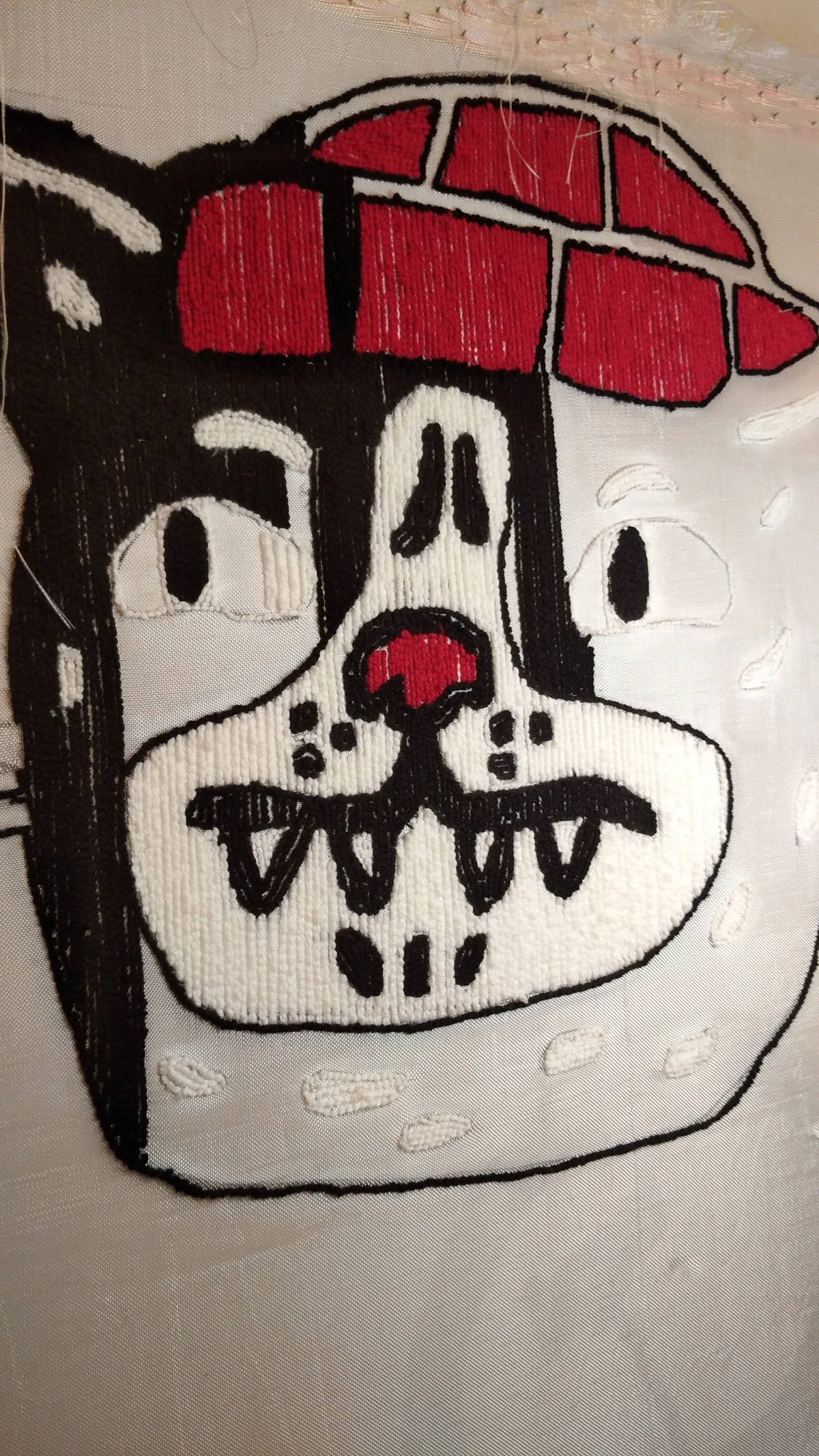
In tufting, a single colour, low loop pile and geometric form all sit well.
A concrete combination: off white wall, 120x160 cm frameless acrylic canvas in two greys, lit by one narrow beam 3000K spot.
Scandinavian#
These rooms run on natural material and low contrast. The job of the artwork is not to raise the volume but to warm the room up.
The range covers pale wood, beige, sand, cool grey, faded blue and olive. Contrast stays gentle. Texture is welcome and arguably necessary: wool, linen, natural yarn. Scale is medium, with pieces between 60x80 and 70x100 cm sitting comfortably. If there is a frame, make it pale oak or natural timber in a slim profile.
This is where tufted panels feel most at home. Soft tones, rounded organic shapes and low contrast are all already part of the language.
A concrete combination: pale grey wall, 90x60 cm loop pile tufted panel in beige, sand and faded olive, hung 22 cm above a natural oak shelf.
Bohemian#
This style has the highest tolerance for texture. Fringe, knots, deep pile and mixed loop heights all belong here.
Colour is generous: terracotta, mustard, brick, deep green, plum. There is no limit on how many colours you use, though if the room is already busy with pattern, let the artwork be the calm part. Scale works in clusters, so three to five pieces of different sizes beat one large one. Frames are usually unnecessary and often cool the work down.
A concrete combination: terracotta wall, a cluster of three tufted panels at 70x50, 45x45 and 55x35 cm, spaced 6 to 8 cm apart, cut pile and loop pile mixed, with a 10 cm fringe under the largest.
Modern classic#
A style of symmetry and deep colour. The work sits in the centre, and here the frame genuinely matters.
The palette is saturated: deep green, navy, burgundy, charcoal, with gold and brass accents. A painted surface where brushwork is visible outperforms a flat print. Scale is single and central; if sconces or vases sit at equal distances on both sides, an asymmetric composition will feel restless.
Frame choice is half the job in this style: a 6 to 8 cm walnut or matt gold profile with a 5 to 7 cm mount.
A concrete combination: matt deep green wall, 70x100 cm acrylic canvas, 7 cm walnut frame, 5 cm cream mount, a 45 cm brass picture light above.
Industrial#
Brick, concrete, raw metal and high ceilings. The job of the artwork here is to soften.
The range runs grey, black, rust, raw white and a small number of strong accents. Texture can stay rough. Scale needs to be big; in a room with a 3 meter ceiling a 60x80 cm piece vanishes, so go to 120 cm wide and beyond. Frames are either absent or thin black metal.
In a hard surfaced loft a soft tufted panel does acoustic work alongside the decorative kind.
A concrete combination: bare brick wall, 100x100 cm frameless canvas in grey and rust, lit by 4000K track spots.
Homes that fit none of the above#
Most homes live here. A wooden console inherited from a grandmother, a ten year old bookcase, a grey sofa bought last year, and a kitchen speaking an entirely different language.
One rule works: pick a linking colour. There is always a colour repeating in at least two places in the room, the mustard in a cushion together with the beige of a rug. Finding that colour in the artwork builds a stronger connection than matching styles ever does.
Mixing rules is allowed. A single fringed bohemian panel in a minimalist room can be the best decision in that room, precisely because the mismatch creates the effect. The mistake is not mixing but hesitating. A room stranded halfway between three styles says nothing at all.
If the size or the palette you have in mind is not in the gallery, a piece can be made to order. On the custom order page the process starts with a 30 percent deposit and runs around 21 days. To see what already exists, the gallery is here.
Frequently Asked Questions
My home is a mix of styles. How do I choose art?
Work from colour rather than style. Find a colour that repeats in at least two places in the room and look for it in the artwork. That link is stronger than stylistic similarity and far more reliable in mixed rooms.
Which interior styles suit a tufted wall panel?
Scandinavian and bohemian rooms are the easiest fit. In a minimalist room it works if you keep to one colour and a low pile. In industrial spaces it is chosen for the way it softens hard surfaces.
How do I decide what size to buy?
Sixty to seventy five percent of the width of the furniture below is a good starting point, so a 200 cm sofa takes something between 120 and 150 cm. In rooms with high ceilings, stay near the top of that range.