Decor
Which Colours Suit Your Room? Choosing Art by Palette
Which colours will work on your wall? A practical way to choose art by reading a room's dominant, secondary and accent tones, and the mistakes to avoid.
Updated:

Getting the size right is something you can learn; colour is where most people get stuck. There is no single answer to "my wall is grey, which colour should I buy", but there is a sound method.
This article sets out that method: how to read a room's colour, how to choose a piece by the role you want it to play, and which mistakes pull a room apart.
First, map the room's palette#
Every room has three colour layers. It is hard to decide without separating them.
The dominant colour covers the largest surfaces: walls, floor, large furniture. Usually neutral, white, grey, beige, a wood tone.
The secondary colour sits on mid-size surfaces: sofa, curtains, rug. This is what gives the room its character.
The accent colour is small and sparse: cushions, a chair, a vase. It never exceeds around ten per cent of the total area.
Photograph your room and write these three down. The decision becomes much easier afterwards.
Decide the piece's role#
A piece does one of two jobs in a room, and it helps to decide which you want from the start.
A harmonising piece speaks from within the existing palette. It carries a shade of the secondary colour, calms the room and creates a sense of coherence. In a room that is already colourful and busy, this is the right answer.
A contrasting piece brings a new colour into the palette and becomes the room's focal point. In neutral, restrained rooms (white walls, grey sofa, wood floor) this is the only right answer. In such a room a harmonising piece simply disappears.
A practical rule: the quieter the room, the louder the piece can be.
In a neutral room#
Most new homes fall into this category: white or pale grey walls, neutral furniture, little colour.
Here the piece can be the only source of colour, and that is an opportunity. What works:
- Choose one strong colour and echo it once more in the room. A cushion or a vase is enough
- Do not shy away from saturated colour. A neutral ground can carry it
- Or do the opposite: play texture instead. A piece that creates surface difference rather than colour (a textured wall panel) warms a neutral room without adding colour
The most common mistake in neutral rooms is buying another neutral piece "to be safe". The result is a wall that says nothing.
In a colourful room#
If the sofa is blue, the rug patterned and the curtains green, the piece should calm things.
The method: take the room's secondary colour and choose a piece carrying a darker or lighter shade of it. Not the same colour, another member of the same family. That ties the piece to the room without feeling repetitive.
An alternative: choose something almost colourless. Black and white, earth tones, texture over a single colour. In a busy room it creates a point where the eye can rest.
Four common colour mistakes#
These come round constantly:
- Matching the piece's ground to the wall colour. A piece in the same tone sticks to the wall and vanishes. You need at least one shade of difference
- Looking for every colour in the room within the piece. A work is not a catalogue; one or two colour links are enough
- Choosing a trend colour. The piece will hang for years; the trend will not last
- Deciding from a screen. Screens are bright, rooms are not. See it in real light where possible, or ask for photographs taken under different lighting
Light changes everything#
The same piece looks cold and matte in a north-facing room and warm and alive in a south-facing one.
North-facing rooms receive bluish light; warm tones (earth, terracotta, mustard) restore the balance. South-facing rooms already have warm light, so cool tones (blue, green, grey) sit better.
Factor in evening light too. If you use the living room mostly in the evening, imagine the piece under warm bulbs, blues deepen and yellows lift in that light.
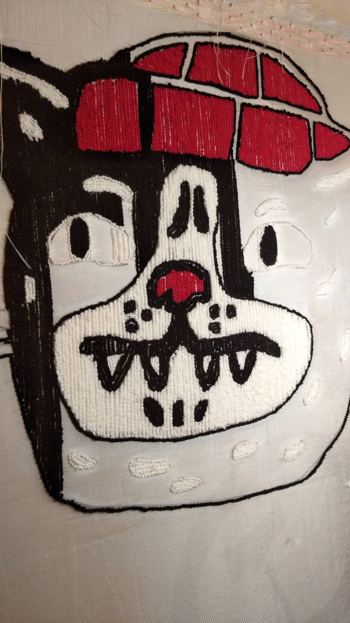
There is also a surface difference: yarn absorbs light while paint reflects it. The same colour reads deeper and more matte on a tufted surface, brighter on canvas.
Test before deciding#
The cheapest and most effective method: find something in the piece's colour and hold it against the wall.
In practice:
- Open the photograph on your phone, hold it towards the wall and step back a few paces
- Prop a fabric, paper or object in the same colour against the wall and leave it all day
- Look in the morning, at midday and in the evening. Colour reads three different ways
This is the colour version of the paper tape test I recommend for size, and it works just as well.
If you are commissioning#
On a custom piece you set the palette, so every decision in this article is in your hands.
The most useful thing is to send a photo of the space. Seeing the room makes it far easier to say which tone will sit well, and if colour accuracy is critical, I send a photograph of the yarn sample before production so the gap between screen and reality is not a surprise.
Choose size and technique on the custom order page and attach a shot of the space; I described how the process runs separately.
To see the colours of finished pieces, the gallery is here.
Frequently Asked Questions
Which colour of art suits my wall?
Separate the room's dominant, secondary and accent colours. In a neutral, restrained room a contrasting piece with strong colour is right; in an already colourful room, a calming piece carrying a lighter or darker shade of the secondary colour works better.
Can the piece be the same colour as the wall?
It should not be. A piece in the same tone sticks to the wall and disappears. You need at least one shade of difference — lighter or darker — or the piece does not read.
How does room light affect colour choice?
North-facing rooms get bluish light, so warm tones (earth, terracotta, mustard) restore balance. South-facing rooms already have warm light, so cool tones (blue, green, grey) sit better. Under warm evening bulbs, blues deepen and yellows lift.
In a neutral room, is a neutral piece the safe choice?
Usually not. It is the most common mistake in neutral rooms and produces a wall that says nothing. A neutral ground can carry strong colour; if you do not want colour, the alternative is a piece that creates textural rather than chromatic difference.
How can I test a colour before ordering?
Open the photograph on your phone, hold it towards the wall and step back; or prop a fabric or paper in the same colour against the wall and leave it all day. Look morning, midday and evening — the colour reads three different ways.